Today I’m going to show off my workflow in stable diffusion. I like to think that I get good results, though it’ll work best with the ‘booru’-based models as most of my experience with this tools comes from those.
Choosing your subject
First, I think about my subject. Be it a cat, dog, mouse or house, the subject is super important as it dictates what model you’ll use, the aspect ratio you render at, and how you format your prompt.
I really like making anime girls, so typically I use ACertainModel, WaifuDiffusion, BPModel, or (with a bit more prompt tuning) Vintedois.
I bet you’re all chomping at the bit to get generating some images, so let’s get to it! I’ll be using ACertainModel for all generations today. For the first prompt, I don’t have much of anything in mind, in a grid of 2x2, the prompt is: “anime girl” (Please note that you can click the image to get the originals and paste them into the “PNG Info” section of the AUTOMATIC1111 WebUI to get all the generation parameters.)
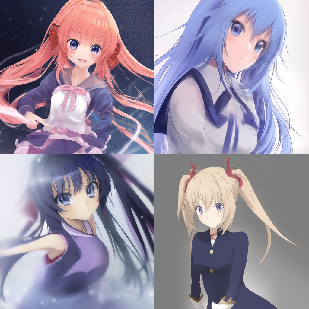
I find that if I’m not quite sure what I’m going for yet, simple prompts are great for inspiration. But wow, already off to a great start!
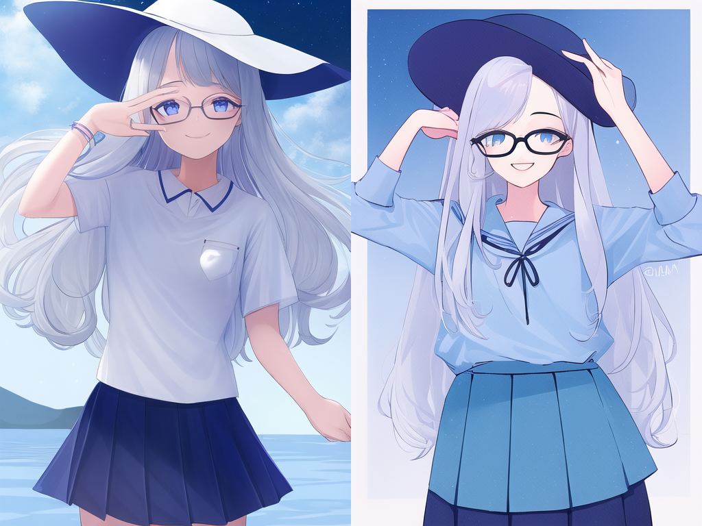
Some things I’m noticing right off the bat is that all the generations are coming out somewhat blurry and they feel like they could use a bit of vertical room to breathe. So let’s do it! This time, in a 1x2 grid (vram constraints :p).
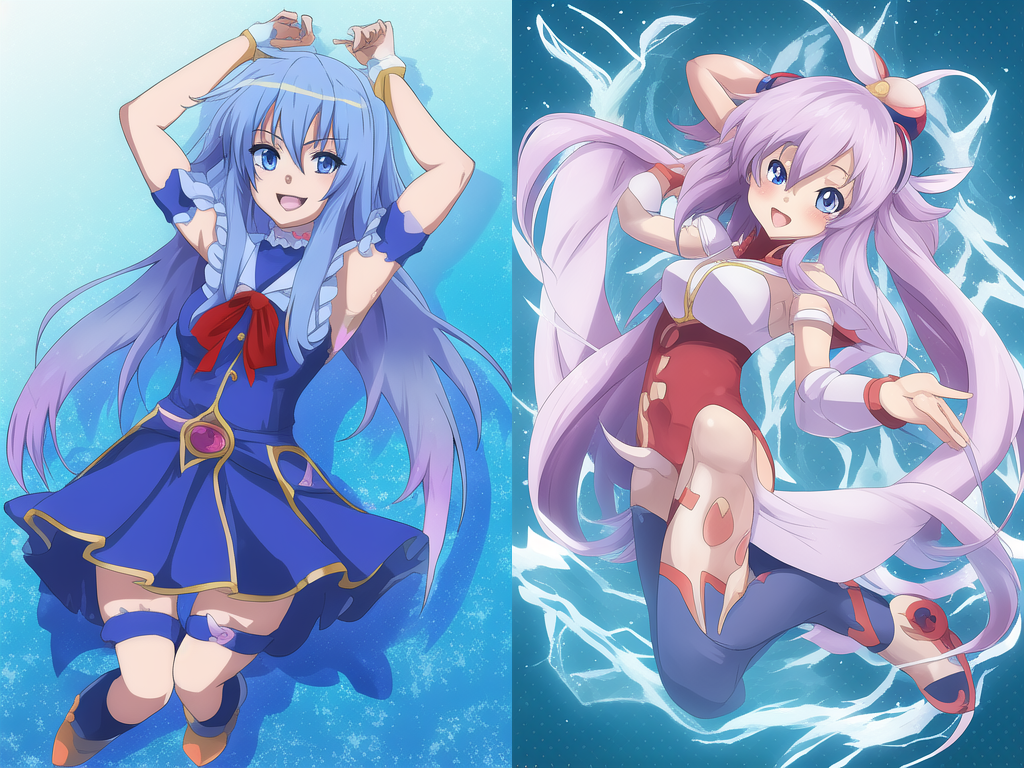
Quite the leap in quality, no? Let’s keep going!
Prompt tuning
So now comes the thinking part, woo! What we need to think about is what we feel is missing from the images and what needs to be taken away. I feel as though these fine ladies could use a hat and glasses and I’m not liking the ‘raw’ anime style. With a little typing and perhaps asking deepbooru (more on that in a bit…) our positive prompt becomes: “1girl hat glasses” and the negative prompt stays at “blurry”. Fire the image generators!
Woah! What’s with that massive drop in image quality, you might find yourself asking. A simple explanation is that “1girl” is a prompt that incorporates many more art styles than “anime girl” and thus requires more prompt tuning. You’ll notice that these images almost feel sketched, rather than looking like a screengrab from an anime. “But I liked the previous images”, I can almost hear you saying. Well, here’s where deepbooru comes in. What you can do is click “Send to img2img” on a picture you like, and then click “Interrogate DeepBooru”. What that’ll do is run the image through another NN trained to give booru tags for a given image.
For example, the first image in the generation before this returns “1girl, :d, armpits, blue eyes, blue hair, gloves, hair between eyes, long hair, looking at viewer, open mouth, sleeveless, smile, solo, star (sky), starry sky”. A bit of a mess, I know, but if you’re unsure what to add to your positive or negative prompts, DeepBooru can be a massive help. Unfortunately it doesn’t work so well for realistic images. Another resource for what to add or take away is to browse danbooru (NSFW Link) or Gelbooru (also NSFW) for images you like, and study the tags, using them as fit in the negative and positive prompts.
Something to keep in mind is that these techniques only sort of work on the more photorealistic focused models and oftentimes when you employ them you’ll get anime-esque results.
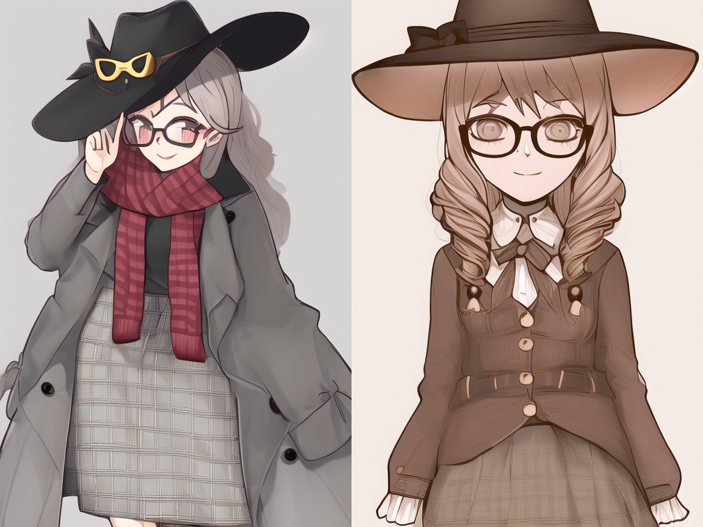
I’ve rambled enough for a bit, let’s generate some more images. I rather like the drill hair and the skirts, let’s tell the model that. Positive prompt is now: “1girl hat glasses pleated skirt drill hair”

…woah. Those are certainly some distorted eyes. Pretty sure it’s a fluke, but let’s add “distorted” to the negative prompt, just in case.
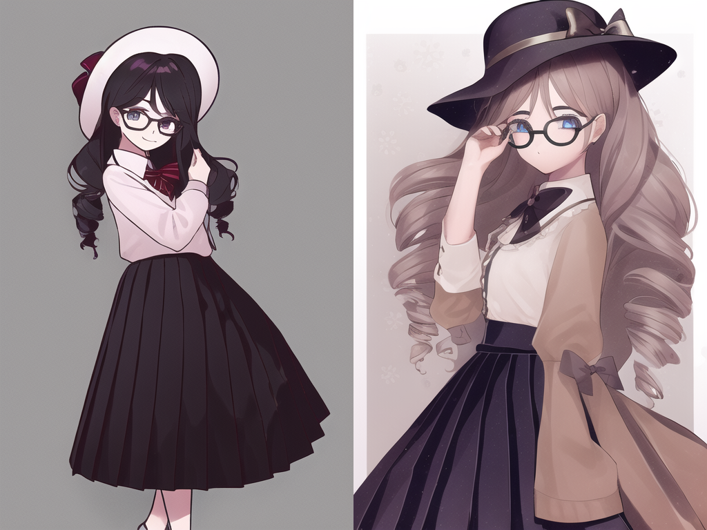
You might have noticed that these images are quite similar in some ways to the last generation, that was an accident on my part, I forgot to change the seed after importing a previous generation’s data. It’s a super cool (if a bit difficult to harness) technique if you want to sort of hold onto an image’s general composition, though it doesn’t always work, especially when you use ‘stronger’ words in your negative and positive prompts, I.E. “neon” or “glowstick”. An aside, but while doing a bit of research while writing, I came across diffusers-interpret. I haven’t played with it at the time of writing, but it seems super cool.
Onwards! I wanted some wild colors, so the positive prompt is now “1girl hat glasses pleated skirt drill hair nebula” and the negative “blurry distorted”.
Huh. Usually “nebula” has a far greater effect than that. These models can be a bit of an enigma sometimes, but I really like the second image. It even has a fairly respectable hand! Also of note is that the seed wasn’t locked for this generation. No idea what’s up with the composition staying fairly similar.
I still want more color though, and I think they should smile. Positive prompt is now “1girl hat glasses smile pleated skirt drill hair galaxies” and the negative is “blurry distorted steampunk”.
hmm… Usually “galaxies” gets some pretty stunning colors. I guess that doesn’t hold true for this model, though it does for plenty of others, most prominently dreamlike-photoreal. Steampunk in the negative knocked out the dreariness, thankfully.
This section is getting rather long, so I’m going to run through a few dozen generations while tuning the prompt and come back with my results, the prompts, and some explanations.
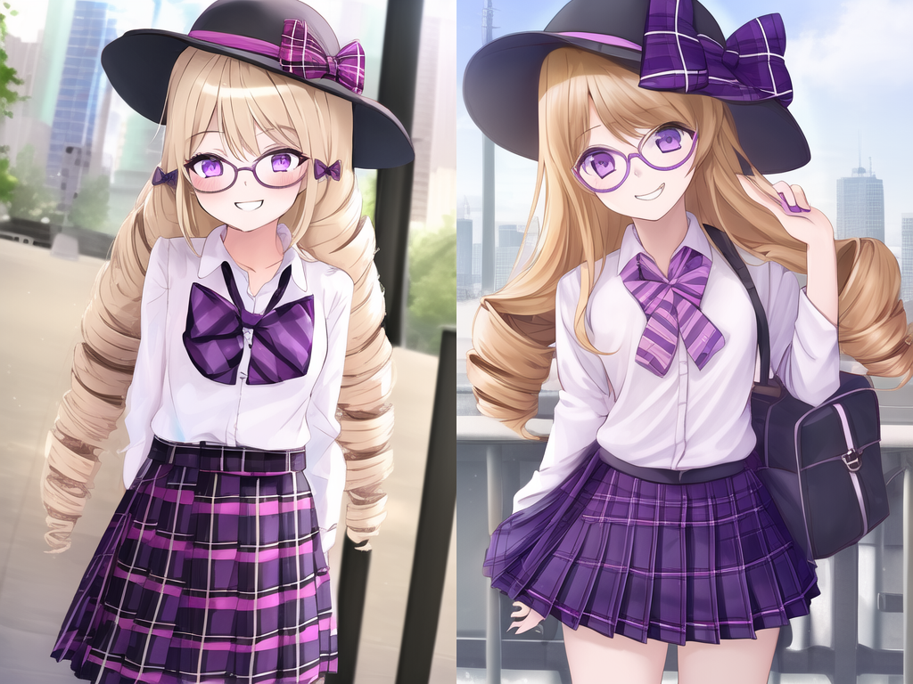
Just 8 generations later, adding features I like and removing those I feel were unnecessary we got these! I particularly like the first one. The positive prompt is “1girl hat glasses smile brightly colored pleated plaid skirt detailed purple eyes bow blond twin drills standing park absurdres” and the negative “blurry distorted extra digits”.
As you would have it, for this model “brightly colored” is the ticket to excellent colors. “absurdres” will only work on booru trained models, it will typically lead to somewhat better quality, as will “detailed” while being a bit more universal. The rest of the tokens I feel don’t need too much explanation as they’re just nouns and adjectives…
I’m really happy with the first image so far, but I think it could use some more hat, and higher resolution is never a bad thing. I guess it’s time to head to the next step!
Post processing
As I want more of the hat to be in frame, I’m going to attempt to outpaint it. To do that, we click “Send to img2img” click script down at the bottom and select “Outpainting mk2”. I’m just going to follow the recommended settings for now, after unticking left, right, and down. Then it’s basically just run generations over and over until you get a satisfactory result, possibly adding undesired features to the negative prompt… Thankfully, the software sort of understands the structure of the hat in this image so it shouldn’t take too long (famous last words…)

>->

Woo! Now that’s a fantastic result. Her hat isn’t perfect, but this is like 10 generations in. >->
Time for upscaling! Click “Send to extras” and under upscaler, choose one appropriate for the task, in this case “R-ESRGAN 4x+ Anime 6b”. I pretty much only ever use the R-ESRGAN 4x+ series, the non-anime for when I want high frequency details to be preserved, and anime when I want things to be a bit smoother. CodeFormer and GFPGAN are face restoration NN models, check the features list for more information.
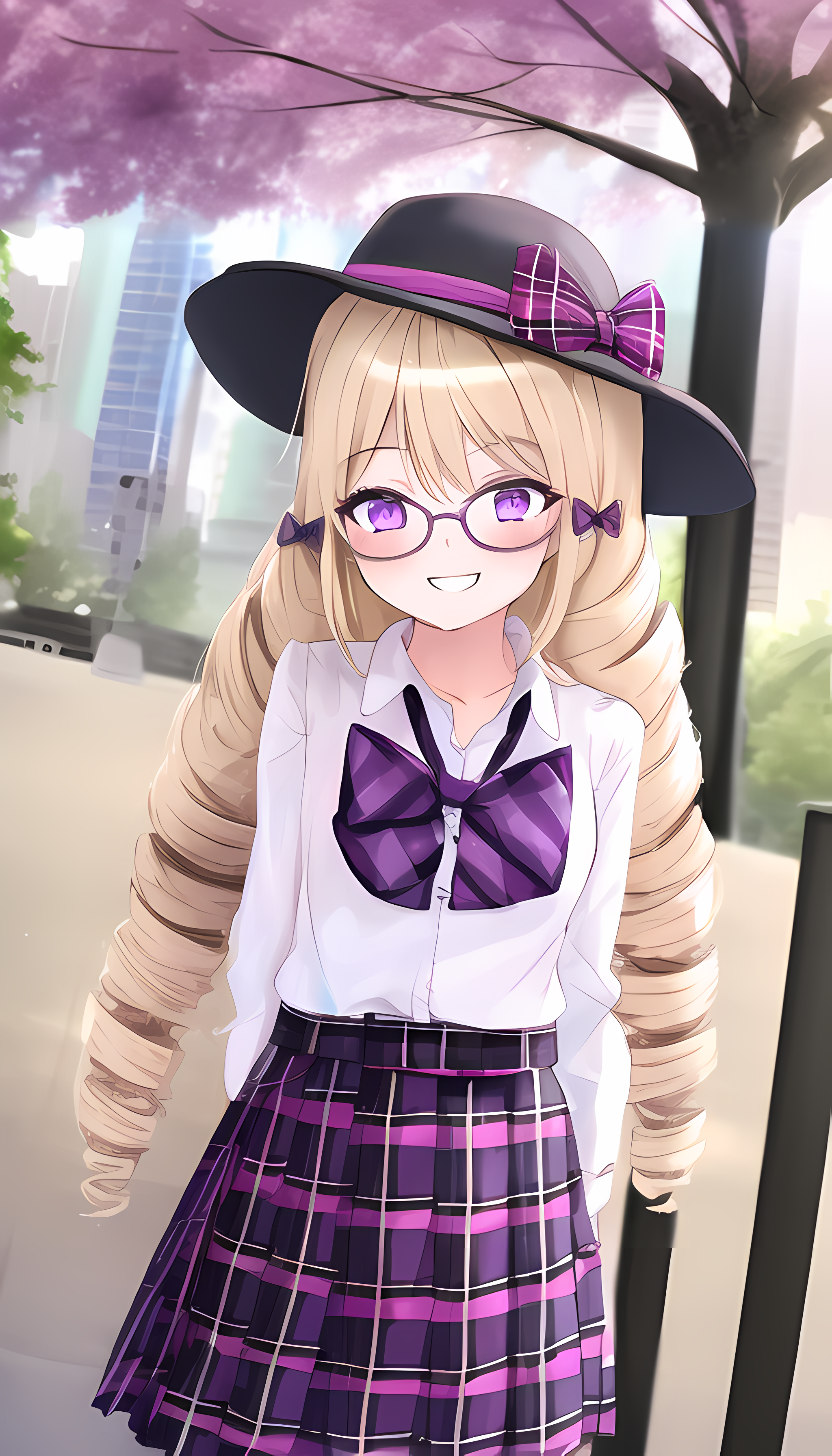
The final result. Pretty sweet, huh? The only real downside to upscaling is that the flaws in the image really shine through. In this case, her left eye is a bit of a mess when you zoom in, but at this scale it’s ok. My general rule for AI generated art in its current state is don’t look to close and you’ll generally be pretty happy.
Anywho, it’s getting late, so I’m finishing up with this post. I’ll have to write about this some more, it’s loads of fun! I actually need to write more in general >-<
See you in the next one!